Christopher Nolan’s Obsession With Blue: Does His Color-Blindness Impact His Posters? Explained
via Imago
Credits: IMAGO / Future Image
Christopher Nolan films appear like architectural spaces built from memory, time, and perception. Long before audiences begin decoding timelines or debating endings, they are already immersed in a carefully controlled visual language. A student of English literature who transformed narrative structure into cinematic grammar, Nolan has always approached images the way a novelist approaches recurring motifs.
Among those motifs, one color has quietly followed him across nearly every frame: blue. Whether it is the icy dreamscapes of Inception, the steel-blue corridors of Tenet, or the stormy coastlines of Dunkirk, a distinct cool-toned palette runs through his work like a signature hidden in plain sight.
Christopher Nolan’s color blindness quietly shaped his cinematic palette
ADVERTISEMENT
Article continues below this ad
Christopher Nolan has openly discussed his red-green color blindness, a condition that affects how certain warm hues are perceived. Speaking about the condition, the filmmaker once explained that he sees what appears to him as a complete spectrum of color.
“As far as I’m concerned, I see a full spectrum of color. I mean, I see the world the way the world looks. I believe that very powerfully, and then someone can objectively give me a test and tells me that, well, there are actually certain distinctions I’m not making, and other distinctions that I’m making more strongly, because I don’t see the range of greens that people see," he said as per Fandomwire.
For people with red-green color blindness, reds and greens can blend into a confusing visual territory. Purples and pinks may also become more difficult to distinguish because they contain red components. Blue, however, exists outside that problematic range. It remains a stable and reliable visual anchor. That reality helps explain why cool blues and neutral greys have become recurring pillars of Nolan's visual design.

And once that visual foundation was established, it began appearing everywhere, from his earliest independent experiments to billion-dollar studio spectacles.
From Memento to Oppenheimer: How blue became part of the Nolan experience
Looking back across Chris Nolan's filmography is like watching a painter revisit the same brushstroke while constantly reinventing the canvas. The blue tint first became noticeable in Memento, where cold motel rooms and fluorescent interiors reflected a protagonist trapped inside fractured memories. It continued through Insomnia, whose washed-out daylight created emotional exhaustion rather than warmth.
By the time Batman Begins arrived, Gotham was drenched in steel blues and charcoal shadows, establishing a grounded comic-book world that felt closer to urban mythology than fantasy.
The visual strategy matured throughout The Prestige, The Dark Knight, and Inception. In each film, blue functions differently. Sometimes it signals mystery. Sometimes it evokes melancholy. Sometimes it simply reinforces scale. Consider the dream corridors of Inception, where cool tones transform modern architecture into something almost subconscious.
Even films rooted in history follow the same philosophy. Dunkirk surrounds its characters with endless blue skies and cold seas, emphasizing isolation and survival. Interstellar uses cosmic blues to make the universe feel both majestic and indifferent. Tenet embraces an even colder digital aesthetic that mirrors its temporal mechanics. Then came Oppenheimer, perhaps the most restrained example yet.
Across twenty-five years of filmmaking, Nolan's palette has evolved, but its core principles remain remarkably consistent. His images rarely shout. They resonate. Like recurring themes in a symphony, the colors return in different forms, carrying emotional meaning accumulated across decades of storytelling.
That continuity now sails into uncharted waters with a filmmaker tackling one of the oldest stories ever told.
The Odyssey continues Christopher Nolan’s visual signature style
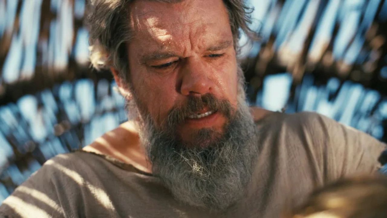
The first footage from The Odyssey immediately feels familiar, even while venturing into entirely new territory. Homer’s epic might be filled with gods, monsters, and mythological wonder, but Chris Nolan appears determined to approach it through the same grounded lens that defined his other classics.
The trailer imagery surrounding Matt Damon’s Odysseus leans heavily into deep ocean hues, storm-filled horizons, and weather-beaten textures. Rather than presenting mythology as fantasy spectacle, Nolan seems interested in treating the ancient tale as a physical journey shaped by natural forces. The blue palette enhances that approach. The sea becomes both a setting and a psychological landscape, mirroring Odysseus' endurance, isolation, and relentless pursuit of home.
ADVERTISEMENT
Article continues below this ad
What makes the project particularly fascinating is the technology behind it. Nolan reportedly challenged IMAX to solve long-standing technical limitations so he could shoot the entire film using IMAX cameras.
Christopher Nolan's relationship with blue has never been a simple stylistic quirk. It is a fascinating intersection of perception, practicality, and artistic philosophy. Whether influenced by color blindness, narrative instinct, or decades of visual experimentation, the result is a body of work whose imagery remains instantly recognizable.
ADVERTISEMENT
Article continues below this ad
What do you think about Nolan's signature blue aesthetic? Is it a product of necessity, artistic preference, or a perfect combination of both? Share your thoughts in the comments.
ADVERTISEMENT

Edited By: Hriddhi Maitra
More from Netflix Junkie on Hollywood News


ADVERTISEMENT